Angharad Derbyshire
This article charts the rise and fall of different fonts from the ancient to the modern world. Appropriately enough, it has been on its own journey.
It started its life in Garamond, but by the time you are reading it, it will have migrated to the taller and wider heights of Antigone’s favoured Baskerville. The Microsoft Word dropdown font menu presents a treasure trove of options, but it would be odd for me to have chosen jokerman, COPPERPLATE GOTHIC, or Curlz MT for a piece such as this. Amongst fonts made for reading, the Roman font rules supreme: a family which includes the grandfatherly Times New Roman, Garamond and Baskerville, each named after the printer who originated their shapes, along with the ever-faithful Constantia.
The name ‘Times New Roman’ may seem bizarre: no Roman ever (obviously!) created a digital font, nor did the Romans have access to the printing press, which would only appear in Europe around 1440 when invented by Johannes Gutenberg (c.1400–68) in Mainz, Germany. But is there, in any case, a connection between the Romans and the font style we use every day? If so, what is it?

Enquiry into the history of the Roman font reveals not only how book-aesthetics in the Italian Renaissance were influenced by a resurgence in interest in Greco-Roman visual aesthetics, as might be expected from the Renaissance. But we can also see how the adoption of Roman font aided the spread and popularization of Renaissance thought across Europe, particularly in Britain. A possible moral of this story is that what is important about a book is not only the ideas it contains, but the way those ideas have been presented on a page.
Before exploring this further, we might first consider what a ‘Roman font’ actually is. To place it in the context of the history of printing, it might be easier to consider what it is not.
It is not:
– Blackletter: the font associated with ‘ye olde fudge shoppe’ and other signs. Often called Gothic script, it was the predecessor of Roman font in printing, based on the letter forms used by Late Medieval scribal hands. Pick up a Gutenberg Bible (if you happen to have one of the existing 48 on your shelf) to see a version of this font.
– Italics: where the letters slope to the right. Also a Renaissance development, this style of font is associated with the Venetian printer Aldus Manutius (1449–1515).
– Sans-Serif: ‘without serif’, a font family which lacks the ‘grooves’ that Roman fonts have at the end of letter forms.
So that’s what it isn’t. Let’s now turn to the Renaissance. As much as it was a rebirth of Classical thinking in terms of philosophy, politics and literature, the Renaissance also involved a rebirth of Classical aesthetics. Michaelangelo was inspired by the rediscovery of Roman and Greek marbles and bronzes, and Leonardo da Vinci’s approach to bodily proportions in his figural work builds upon Vitruvian ideas, hence, the Vitruvian Man. Just as Leonardo desired to emulate Classical predecessors, so the typesetters and printers of the Renaissance desired to create works of art (for this is what the earliest printed books were, as well as being functional objects). These books looked back to an aesthetic rooted in Roman antiquity. When they constructed the Roman font, Renaissance printers paradoxically turned ad fontes to create a distinctively modern aesthetic.

The birth of Italian humanism in the 14th century engendered a new attitude not only to literature and the arts (and more), but also to handwriting. Italian gothic rotunda was occasionally difficult to read, cramped, and over-abbreviated. Petrarch, the 14th-century humanist, is often invoked to explain why slightly later humanists, led by Coluccio Salutati, Niccolò Niccoli and Poggio Bracciolini, developed their own script – called ‘humanist rotunda’ – which would later play a starring role in the development of the Roman typeface.
Salutati (1331–1406), Niccoli (1364–1437) and Poggio (1380–1459) are three figures who dominate our understanding of the Italian Renaissance. All three made their careers in Florence, and the latter two were associated with Cosimo de’ Medici, Florence’s powerful ruler, who was also an influential patron of the arts. All three men acquired Classical manuscripts and discovered ‘lost’ texts which we take for granted today, perhaps the most astonishing being Poggio’s discovery of Lucretius’ philosophical epic De Rerum Natura in a German abbey in 1417. Niccoli, interestingly enough for our purposes, was the first to write in the cursive script we might call ‘Italic’, copying out some of his manuscripts in a tilted style. Although these men were not directly connected to printing, their work to find manuscripts, and then to copy and comment on them (see below Salutati’s remarks in the margins of one of the earliest Catullus manuscripts), brought more texts into circulation, and encouraged others to take an interest in and think critically about Classical texts, establishing the intellectual foundations of the Italian Renaissance.


Petrarch (Francesco Petrarca, 1304–74), who belonged to the generation before Salutati, is a similarly dominant figure. His work included searching European libraries for Classical manuscripts (his discoveries include Cicero’s Letters to Atticus), and writing his own works based around Classical models, such as letters to Cicero and Virgil themselves. His Seniles or ‘Letters of Old Age’ were written between 1361 and 1373, and are addressed to Petrarch’s contemporaries, although he does give one the pseudonym of ‘Socrates’. In Seniles, Petrarch describes the earlier style of Carolingian Minuscule (known then as ‘lettera antica’) as castigata et clara (“pure and clear”), revealing of attitudes towards rotunda (which was often anything but), and praises its ‘harmony’ to Boccaccio. It seems, then, that pre-printing, there was an appetite for a more legible style of writing for communicating the messages of the Renaissance. Shortly after (c.1400) humanist script was born, whose style was differentiated from the spurned gothic rotunda by its upright orientation, roundness, and relative lack of abbreviation.

The Roman typeface originated through gradual experimentation by 15th-century Italian printing houses, but it is Nicholas Jenson (c.1420-80, a Frenchman based in Venice from 1468) who is credited with the first ‘Roman fount’ in 1470 for an edition of Eusebius. In doing so, he produced printed texts which had letter forms that resembled contemporary humanist manuscripts, providing an alternative to the handwritten texts which used the older technology of pen and vellum. Jenson’s punchcutting was not practised in isolation, however: in 1467, the printers Sweynheym and Pannartz attempted to mimic humanist ‘half Roman’ handwriting in their printed texts. These printers were originally from Eltville (near Mainz) and Prague respectively, but by 1467 had moved their press to a Benedictine Abbey in Subiaco, near Rome, where they worked for Cardinal Turrecremata. They later moved to Rome, where they specialised in patristic and Classical texts. The fonts they cut were mainly destined for Classical and Patristic texts (Davies 2004), including a 1467 edition of Cicero’s Epistulae ad Familiares printed in Rome. As the Polonsky Foundation Digitization Project has discussed on their blog with reference to this case study, the use of Roman caught on, with subsequent incunabula of Epistulae ad familiares in 1469, 1476 and 1480 also printed in Roman.

The upper case in Roman typeface traces a more secure link to the actual Romans of antiquity. This connection is evident in Roman square capitals, found on imperial inscriptions, in which there was already an artistic interest shown by designers such as Felice Feliciano (1433–79). When united with the ‘littera antica’ style lower case, Roman typefaces were forged from two Roman/pseudo-Roman sources: one was actual Roman inscriptions, and the other ‘Carolingian’ manuscripts (written in or around the age of Charlemagne, AD c.747–814) some humanists believed to have used a writing style that hailed directly from antiquity. It thus becomes very easy to see why the Roman typeface is called Roman in the first place.

Since our understanding of ‘how writing looks’ is inseparable from the Roman font, it may be difficult at first to see how remarkable this change was to the aesthetics of the page. This swerve, away from the Gothic print of the Gutenberg Bible, towards a spacier, squarer and ultimately more legible page certainly clarified readers’ comprehension of what was actually on the page. Yet it also created a reading aesthetic which was thought to mimic Roman writing in both its upper and lower case forms.
Alongside a revolution in the visual arts, therefore, there also occurred a revolution in the reading aesthetic. One could also speculate that the use of inscriptional capitals in the upper case of Roman imbued the text with a sense of imperial power and authority over the reader, both daringly new and rooted in Roman authority and Roman tradition: all the better to print Latin in, one might think. Indeed, it is also interesting to note that the square capitals used were of a specific inscriptional type: the even, organised capitals characteristic of the Late Republic and Early Principate (1st centuries BC and AD) were preferred to the slightly scrappier, more uneven capitals of Latin inscriptions from later antiquity. Capitals embodied the power, certainty, and authority of the Roman empire far more effectively, one could speculate, than the uneven and less confident inscriptions of an empire gradually falling apart, even if the latter type’s letter forms were occasionally more ornate.
Although the first half of this article has been concerned with what the Classical tradition gave to this revolution in typeface, let’s turn now to what the revolution in typeface gave to the Classical tradition.
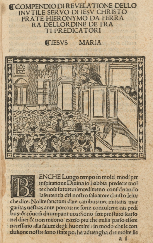
Roman typeface took a while to make the journey across land and sea to Great Britain. Although Jenson’s font was cut in 1470, the first English printed book which uses Roman typeface in any measure (and here minimally) was a 1509 edition of Sermo Fratris Hieronymi de Ferraria in Vigilia Nativitatis Domini (Sermon of Brother Hieronymus/Girolamo of Ferrara on the Vigil of the Lord’s Birth) by Girolamo Savonarola, a 15th-century Dominican friar who attempted to reform Florence into a democratic republic after the ruling Medici was (temporarily) expelled from the city-state. It was not until the years spanning 1580–95 that Roman font usurped Blackletter as the most popular style, attributed to a surge of interest in Italianate fashion amongst English consumers. It is important to recognise that whilst the Renaissance in England is typically dated after the continental – particularly the Italian – Renaissance (as much as anyone can date cultural phenomena), the English Renaissance was well under way by the mid-16th century. None the less, what I would argue is that the spread of Roman contributed to changing the aesthetics of information display, and helped assimilate English and continental (again, particularly Italian) Renaissance thought.

Using Roman forged a visual connection between exciting publications of Classical scholarship (such as Bynneman’s Latin dictionary and Wolfe’s edition of Tacitus’ La Vita di Giulio Agricola), Classicising literature in English (such as Lyly’s Sapho and Phao), and editions of continental literature, such as Field’s 1591 edition of the translator (and inventor of the first English flushing toilet) John Harington’s version of Ariosto’s Italian romantic epic Orlando Furioso. Roman has crucial advantages over Blackletter: it’s much harder to mix up or misapprehend something printed in Roman than it is something printed in Blackletter’s maddening thickets of ascenders and descenders. A fashion statement it may have been, but it also made texts appear more clearly on the page, giving Roman font a functional advantage. Perhaps this was another piece of the puzzle of why book consumption increased so much in the 16th century. An increase has been tabulated of 12.7 books per 1,000 inhabitants in Britain from 1501–50 to 1551–1600, and between the latter period and 1601–50 there is a further increase of 52.7, to 80 books per 1,000. Alongside the spread of mass literacy, perhaps people were just willing to spend more on a product which was both functional and fashionable, therefore deepening engagement with literary and intellectual discourses.
An additional interesting aspect of the history of the Roman font in English printing is that although initially it came to be used in the very opposite way that Blackletter was – to ‘foreignize’ how information appeared on the page – the Roman font gradually found a permanent home in England. This is seen nowhere better than in Field’s 1591 Orlando Furioso (mentioned above), where the Italian edition’s italics have been replaced by the now ‘anglicising’ Roman. This served the role of associating and modernising the aesthetics of both English printing and intellectual discourse through continental moulds, which then perhaps had the same effects on the intellectual contents of those books.

It would be foolish to argue that the shift in Roman catalysed an English interest in Classical literature and discourse, or that it was even the main factor in why so many scholars worked on Classical texts with renewed interest (although the story of printing plays a major part here). However, the rapid popularisation of the Roman font in English printed books does at least indicate that even on the level of reading aesthetics, English printers were closely observant of the trends of the Continental Renaissance, and that for English book-buyers there was an appetite (however lagging) to appear up-to-the-minute with the aesthetics of their literary consumption.
The history of the Roman font is triangular, taking us from the Romans themselves (or at least those perceived as Romans) gifting printers letter forms, to those European printers giving the gift of clarity to Roman writing (amongst others) via these letter forms themselves. Although this is something of an oversimplification, the journey of Romans → Roman → Romans should make us appreciate that the history of the printed book is not just important in terms of the contents of the books themselves, but also that we should pay more attention to the shapes of the letters on the page. They, too, have their stories.

Angharad Derbyshire is an MPhil student in Classics at Trinity College, Cambridge, who is interested in Imperial Latin and Greek literature and landscapes in text and art. Her handwriting sits proudly in the bottom 0.2% of Cambridge students and so she is grateful that typefaces exist. She has written previously for Antigone about the tangible presence of the Romans in Britain.
Further Reading
L.D. Reynolds and N.G. Wilson’s Scribes and Scholars (4th ed., Oxford UP, 2013) contains fascinating discussion about the transmission of texts during the Renaissance, and also has an excellent and accessible chapter on textual criticism. More generally, Mary Hollingsworth’s The Medici (Head of Zeus, London, 2017) focuses on Renaissance Florence under (unsurprisingly) the Medici family, and is also worth reading for background about the crucible of the Italian Renaissance.
For font specific reading, Mark Bland’s 1998 article “The appearance of text in Early Modern England” (Text: An Interdisciplinary Annual of Textual Studies 11, 91–154) is the hefty authority on the matter of font in English printing. In The Cambridge Companion to Renaissance Humanism (Cambridge UP, 2016) there is also a chapter entitled “Humanism in script and print in the fifteenth century” by Martin Davies, which delves into the issue of where the Roman font actually came from and its links with the Carolingian hand.